Vitepress 是一款基于Vite 的静态站点生成工具。开发的初衷就是为了建设 Vue 的文档。Vitepress 的方便之处在于,可以使用流行的 Markdown 语法进行编写,也可以直接运行 Vue 的代码。也就是说,它能很方便地完成展示组件 Demo 的任务。
使用 Vitepress 作为文档建设工具还有另外一个好处。由于 Vitepress 是基于 Vite 的,所以它也很好的继承了 Bundless 特性,开发的代码能以“秒级”速度在文档中看到运行效果,完全可以充当调试工具来使用。所以通常情况下我开发组件时,就会直接选择在 Vitepress 上进行调试。这个开发方式大家也可以尝试一下。
知识点
-
利用 Vitepress 搭建生成文档网站 -
引用组件并展示到 Demo -
引入代码示例提高阅读体验
【task1】搭建Vitepress生成文档网站
安装开发依赖
pnpm i vitepress -D
配置vitepress的vite配置
默认 Vitepress 是无需配置
vitepress.config.ts的,但是组件库中需要支持 JSX 语法与 UnoCSS,所以就需要添加配置文件。
文件名:docs/vite.config.ts
import { defineConfig } from "vite";
import vueJsx from "@vitejs/plugin-vue-jsx";
import Unocss from "../config/unocss";
// https://vitejs.dev/config/

export default defineConfig({
  plugins: [
    // 添加JSX插件
    vueJsx(),
    Unocss(),
  ],
    // 这里变更一下端口
  server: {
    port: 3000
  }
});
创建文档首页
文件名:docs/index.md
## hello Vitepress

const str:string = "hello vitepress"
增加文档启动脚本
{
  "scripts": {
    "docs:dev": "vitepress dev docs",
    "docs:build": "vitepress build docs",
    "docs:serve": "vitepress serve docs"
  }
}
运行文档站点
pnpm docs:dev
在浏览器查看结果
vitepress v1.0.0-alpha.28

  ➜  Local:   http://localhost:3000/
  ➜  Network: use --host to expose
在这里报了一个错误:
[unocss] entry module not found, have you add `import 'uno.css'` in your main entry?
这里重启一下项目。至此vitePress测试成功。
【task2】引用组件并展示到 Demo
构建docs目录
docs
 |--- .vitepress
 |  |--- theme
 |  |     |--- index.ts
 |  |--- config.ts
 |--- components
 |      |--- button
 |      |      |--- index.md
 |      |--- index.md
 |      | ...
 |--- index.md
 |--- vite.config.ts
子菜单所对应的 markdwon 文件路径(默认页面 index.md)
配置菜单项
文件名:docs/.vitepress/config.ts
const sidebar = {
  '/': [
    {
      text: 'Guide',
      items: [
        { text: '快速开始', link: '/' },
        { text: '通用', link: '/components/button/' },
      ]
    }
  ]
}
const config = {
  themeConfig: {
    sidebar,
  }
}
export default config
在主题中引入组件
文件名:docs/.vitepress/theme/index.ts
import Theme from 'vitepress/dist/client/theme-default/index.js'
import SmartyUI from '../../../src/entry'

export default {
  ...Theme, // 默认主题
  enhanceApp({ app }) {
    app.use(SmartyUI)
  },
}
编写组件文档
文件名:docs/components/button/index.md
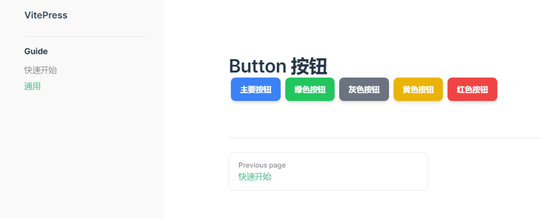
# Button 按钮

  <div style="margin-bottom:20px;">
    <SButton color="blue">主要按钮</SButton>
    <SButton color="green">绿色按钮</SButton>
    <SButton color="gray">灰色按钮</SButton>
    <SButton color="yellow">黄色按钮</SButton>
    <SButton color="red">红色按钮</SButton>
  </div>
重启文件站点
pnpm docs:dev
浏览器查看结果
vitepress v1.0.0-alpha.28

  ➜  Local:   http://localhost:3000/
  ➜  Network: use --host to expose
【task3】引入组件代码提高阅读
修改sidebar
文件名:docs/.vitepress/config.ts
const sidebar = {
  '/': [
    {
      text: 'Guide',
      items: [
        { text: '快速开始', link: '/' },
        { text: '通用', link: '/components/button/' },
      ]
    },
    {
      text: 'Components',
      items: [
        { text: '组件', link: '/components/' },
        { text: '按钮', link: '/components/button/' },
      ]
    }
  ]
}
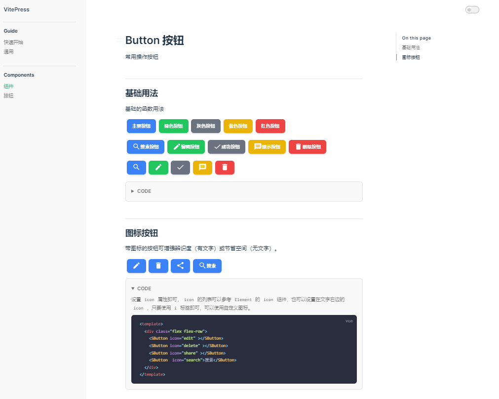
常用操作按钮
基础的函数用法
 <div style="margin-bottom:20px;">
    <SButton color="blue">主要按钮</SButton>
    <SButton color="green">绿色按钮</SButton>
    <SButton color="gray">灰色按钮</SButton>
    <SButton color="yellow">黄色按钮</SButton>
    <SButton color="red">红色按钮</SButton>
  </div>


  <div style="margin-bottom:20px;">
    <SButton color="blue"  icon="search">搜索按钮</SButton>
    <SButton color="green"  icon="edit">编辑按钮</SButton>
    <SButton color="gray"  icon="check">成功按钮</SButton>
    <SButton color="yellow"  icon="message">提示按钮</SButton>
    <SButton color="red"  icon="delete">删除按钮</SButton>
  </div>
  <div style="margin-bottom:20px;">
    <SButton color="blue"  icon="search"></SButton>
    <SButton color="green"  icon="edit"></SButton>
    <SButton color="gray"  icon="check"></SButton>
    <SButton color="yellow"  icon="message"></SButton>
    <SButton color="red"  icon="delete"></SButton>
  </div>
使用size、color、pain、round属性来定义 Button 的样式。
<template>
   <div style="margin-bottom:20px;">
    <SButton color="blue">主要按钮</SButton>
    <SButton color="green">绿色按钮</SButton>
    <SButton color="gray">灰色按钮</SButton>
    <SButton color="yellow">黄色按钮</SButton>
    <SButton color="red">红色按钮</SButton>
  </div>


  <div style="margin-bottom:20px;">
    <SButton color="blue"  icon="search">搜索按钮</SButton>
    <SButton color="green"  icon="edit">编辑按钮</SButton>
    <SButton color="gray"  icon="check">成功按钮</SButton>
    <SButton color="yellow"  icon="message">提示按钮</SButton>
    <SButton color="red"  icon="delete">删除按钮</SButton>
  </div>
  <div style="margin-bottom:20px;">
    <SButton color="blue"  icon="search"></SButton>
    <SButton color="green"  icon="edit"></SButton>
    <SButton color="gray"  icon="check"></SButton>
    <SButton color="yellow"  icon="message"></SButton>
    <SButton color="red"  icon="delete"></SButton>
  </div>

</template>
图标按钮
带图标的按钮可增强辨识度(有文字)或节省空间(无文字)。
<div class="flex flex-row">
    <SButton icon="edit" plain></SButton>
    <SButton icon="delete" plain></SButton>
    <SButton icon="share" plain></SButton>
    <SButton round plain icon="search">搜索</SButton>
  </div>
设置 icon 属性即可,icon 的列表可以参考 Element 的 icon 组件,也可以设置在文字右边的 icon ,只要使用 i 标签即可,可以使用自定义图标。
<template>
  <div class="flex flex-row">
    <SButton icon="edit" ></SButton>
    <SButton icon="delete" ></SButton>
    <SButton icon="share" ></SButton>
    <SButton  icon="search">搜索</SButton>
  </div>
</template>
重启文档站点
pnpm docs:dev
在浏览器查看效果
1、本网站名称:帝企吧
2、本站永久网址:https://www.diqiba.com
3、本网站的文章部分内容可能来源于网络及作者投稿,仅供大家学习与参考,如有侵权,请联系站长进行删除处理。
4、本站一切资源不代表本站立场,并不代表本站赞同其观点和对其真实性负责。
5、本站一律禁止以任何方式发布或转载任何违法的相关信息,访客发现请向站长举报。
6、本站资源大多存储在云盘,如发现链接失效,请联系我们我们会第一时间更新。
7、本站所有资源来源于互联网,仅用于学习及参考使用,切勿用于商业用途,如产生法律纠纷本站概不负责! 8、资源除标明原创外均来自网络转载,版权归原作者所有,若侵犯到您权益请联系我们删除,我们将及时处理! 9、若您需使用非免费的软件或服务,请购买正版授权并合法使用!
评论(0)